Post
CariploScienza: how to design a data-driven infographic
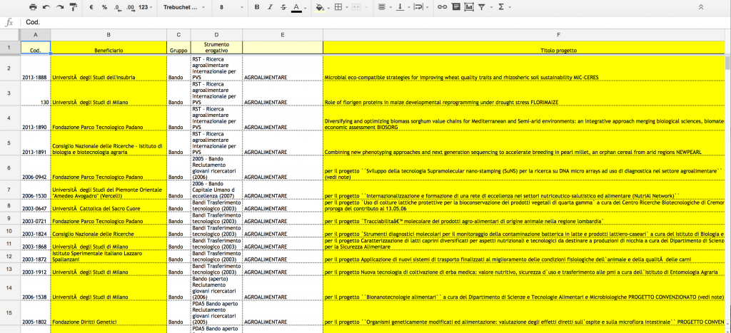
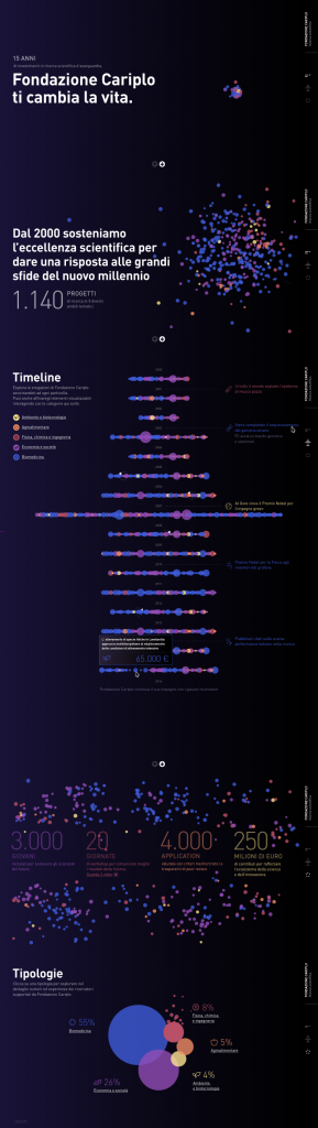
It all began with an excel spreadsheet. A long file with over 1200 lines, accompanied by a special request: “We’d like to tell 15 years of investments in scientific research by Fondazione Cariplo in a new way”.
Where to begin? What approach should be chosen to effectively communicate such a wealth of projects in so many different areas, organised in “tenders” and with a somewhat obscure language?
- Data & stories
Two approaches were chosen from the get-go.
1) Data-driven, in the form of an interactive infographic combining user-friendliness, aesthetic and a strong exploratory element
2) Storytelling, using “thematic” itineraries and a number of video interviews to tell about the humane side of researchers
The first step was data analysis: breaking down the financing reported in the Excel file by thematic categories (going beyond the technical tender lingo) and understand how they were placed in time and what impact they produced on the scientific research of the recent past.
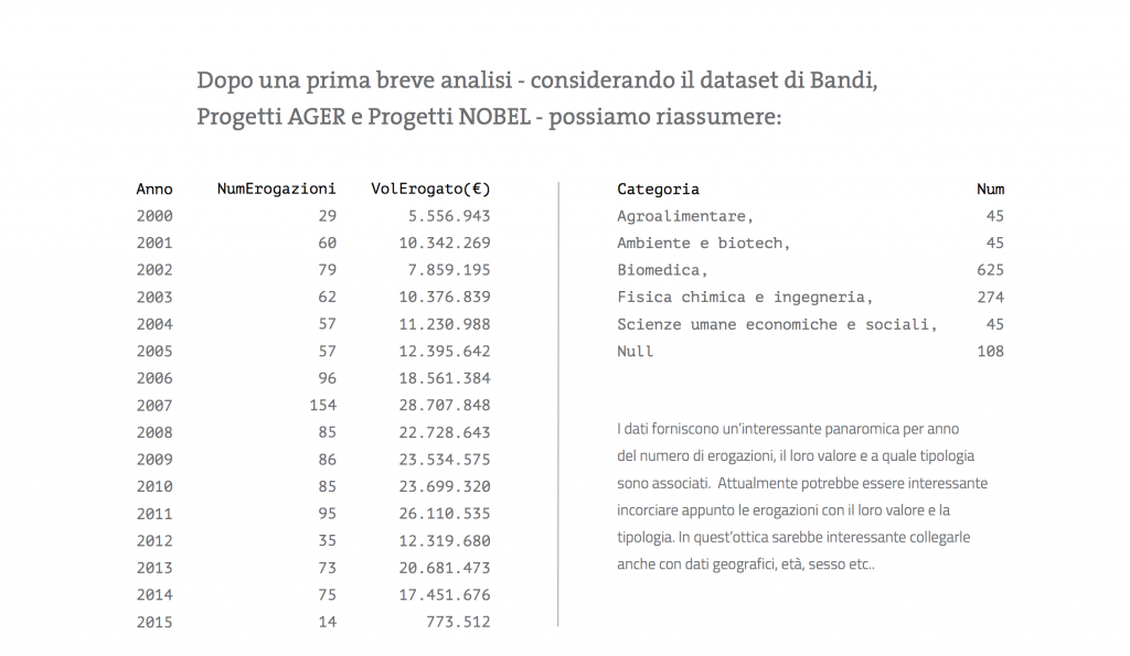
“Paradoxically, raw data are worthless in the common eye, and yet its potential is limitless”, explains Francesco Carletto, art director for the project. “It is crucial to identify significant patterns allowing us to tell a story. Not only, an interesting element may be portrayed in different forms: what visual concepts can tell about scientific research? And focusing on a user-centred project where the following is attained at once: a) an overall view, b) a narrative-exploratory process; c) a punctual analysis of the funding d) a good user experience?
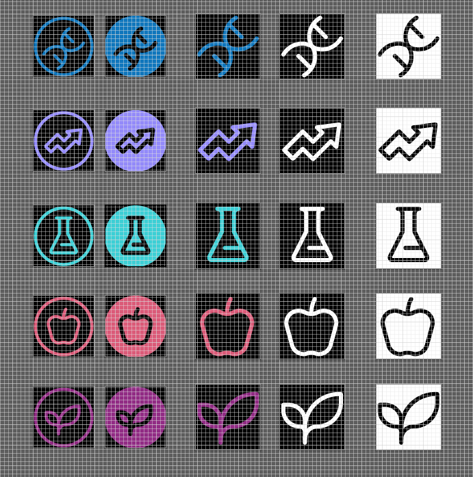
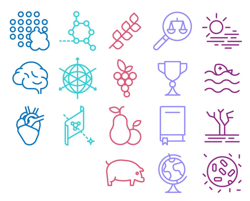
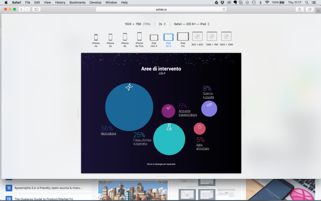
In order to answer these questions, the working team, supported by the area managers of Fondazione Cariplo, started by singling out 5 categories that, beyond internal language and tenders, could tell in what the Scientific Area had invested effectively. This is how the project took shape around 5 thematic macro-areas, each with a visual identity of its own.
- Biomedicine
- Physics, Chemistry and Engineering
- Science and Society
- Agrifood
- Environment and Biotechnology
- “Nothing is lost, nothing is created, everything is transformed”
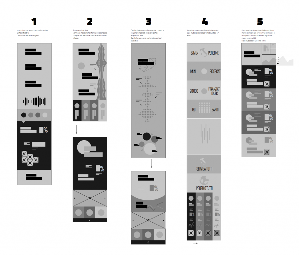
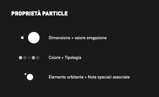
After this first work on contents, a number of visual tests were sketched (manually) using various approaches: graphic (steamgraph), illustrated (pictograms), narrative (typography), as well as explanatory (numbers and icons). Since the beginning a model appeared to be the most appropriate: number 3 of the image above, the one we called “particle”. That is, a long timeline formed by 1200 particles, each representing a single project financed over 15 years of activity. A way to convey the complexity and the unity of action.
“We took hint from one of the great principles regulating the work of physics Nothing is lost, nothing is created, everything is transformed by Antoine-Laurent de Lavoiser”, explains Carletto. “The law of conservation of mass inspired us to use always the same particles (the grants) to tell first about the emotional aspect, and second about the time and, finally, group it all into types”.
Vis-à-vis the other, rather iconographic or narrative approaches, the particle way had remarkable intrinsic complexity to it: how to move 1200 particles on a screen without crashing the browser? How to turn this metaphor on mobile screens? These doubts were overcome thanks to the support of Aaron Syed, a developer who immediately selected some latest-generation frameworks to better express the concept while ensuring the user-friendliness of it all.
- Wireframe & Design
Upon defining the infographic wireframe, we focused on the design elements: first of all, the choice of the colour palette. Below is a first draft with warmer colours, which was later discarded in that it was problematic in relation to the visual identity of Fondazione Cariplo (which uses warm colours for other themes).
Then we composed the iconographic and illustration set on the various theme, colour and content variants.
- User Experience and Development: a complete experience
Upon defining the design in the double desktop and mobile version, we moved on to the Development and Interaction phases in order to define the animations and movements within an interactive space.
Finally, the last part was without a doubt the most challenging and complex: compatibility tests for various types of screens and devices.
On the technical side we designed a complete experience allowing to explore and drill down to the smallest details, which could at the same time tell about the key messages while being nimbler than UX and technical requirements (GPU and browser). When working with state-of-the-art means, one must also consider those who cannot be always up to date.
- A non-conventional product
Given the profiles it recruits, the technology it employs, its visual identity and the user-experience, #CariploScienza is without any doubt a non-conventional product. The working team had to balance UX, visual and interaction design skills, but also coding, storytelling and content organisation skills.
“We had the chance to experiment with new visualisations and technologies – explains Carletto – and thus we designed a product that is simple though at the same time stands as an example of research and innovation, much like its content”.
Meet the Media Guru is organised in partnership with Fastweb, Artemide, Fondazione Fiera Milano, under the patronage of Regione Lombardia and Fondazione Cariplo and in collaboration with Institute without Boundaries | George Brown College – Toronto.
